List items
Items from the current list are shown below.
Waste
4 Jun 2023 : A Year Being Human: Inputs and Outputs #
Last year was my last spent living in Finland, during which time I weighed all of my rubbish, split into categories. But last year I also collected data not just on my outputs, but also on my inputs too. All of my household purchases I recorded and stored in a big CSV file. I managed to collect a full 12 months' worth of waste and consumption data, in the hope that I could analyse them, compare them, and maybe extract something useful from them. Something about the cycles in my life, or how to make myself less damaging to the environment.
It's now Sunday 4th June, nearly six months after I moved from Finland to the UK and finished collecting data, and high time I put pen to paper... fingers to keyboard... to write up the results. There's going to be quite a lot to look at here, so I've split it into three sections: my waste data output; my consumption data input; and how they relate to one another.
Waste Data Output
Let's start with my outputs. I collected data about my rubbish from 18th August 2019 through to 1st January 2023, nearly three and a half years. You can read all about the results from earlier years on my waste pages.
What of 2022? As with previous years there are peaks and troughs that go alongside my activities. There's a big spike around Christmas when Joanna visited and we had two whole people living in my flat (we don't see the same spike in 2021 because that year I spent Christmas with Joanna in the UK). There's a trough around August when Joanna and I went on holiday. Similar holiday troughs — at slightly different times of year — can be seen in 2020 and 2021.
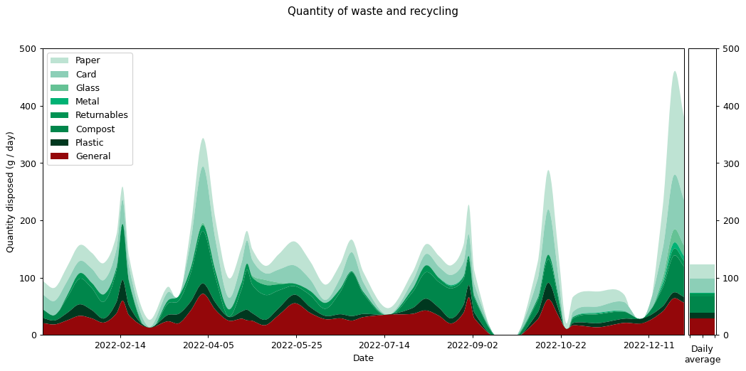
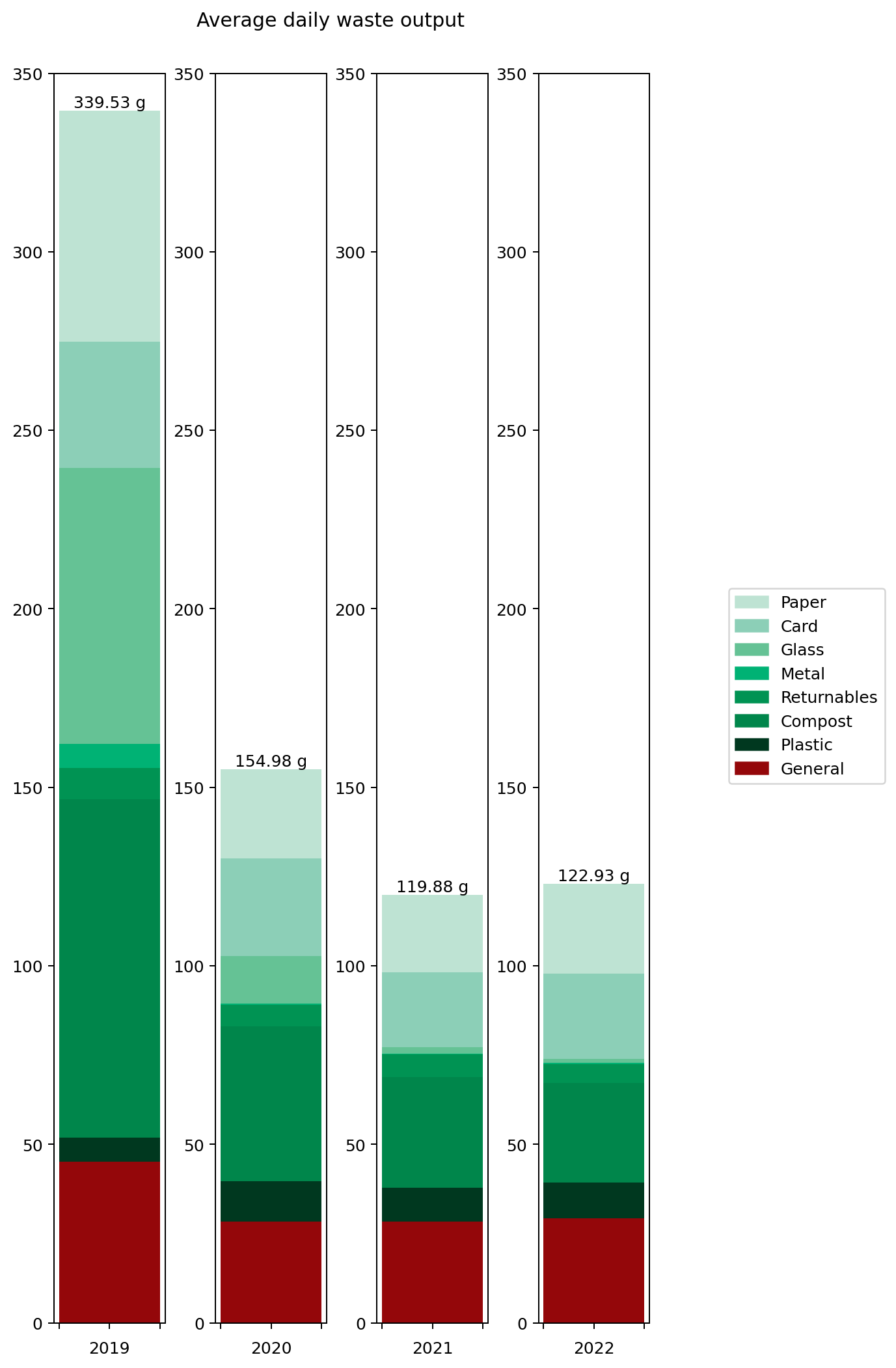
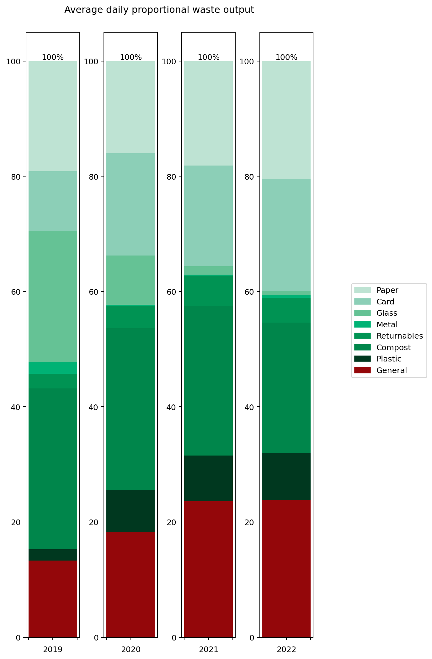
It's hard to get an overall picture from this temporal view, so perhaps the overall averages for the different categories are more insightful. These are shown on the right hand side of the graph. It's also interesting to compare them against previous years. Here's the same information collated into a couple of graphs.
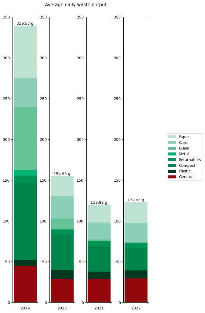
On the left hand side we can see the weight of waste output for each category. This is the average daily output for the stated year. As you can see, I worked quite hard to reduce my waste output year-on-year, cutting it by around half in 2020 and then by nearly a quarter again in 2021. That seems to have been my limit though: my 2022 level is just marginally higher than in 2021.
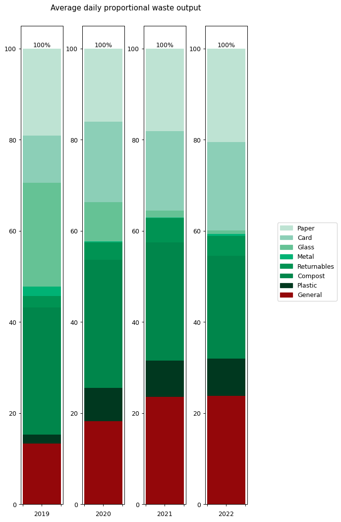
To understand what changed, it's helpful to look at the graphs in terms of proportions rather than absolute values. The right hand graph shows each of the outputs as a proportion of the total year's output. What we can see is that from 2019 to 2021 I greatly reduced my glass and metal output. Looking at both graphs, we can see that I also reduced my paper and compost output quite considerably, but not as an overall proportion.
In contrast, both the proportions and absolute values for 2021 and 2022 are very similar.
None of this is a huge surprise to me: I worked really hard to reduce my glass, metal and paper waste. I cut glass bottles and metal cans out of my shop almost entirely, switching them to plastic bottles, cardboard cartons and cardboard containers instead. You can read more about my reasoning for doing this in an earlier post. I cut down my paper waste output by putting a sing reading 'Ei mainoksia kiitos!' on my door (simple things) and by restructuring my magazine and postal subscriptions.
The following table gives the values for each of the categories in full. This is my average daily waste output measured in grammes.
These values are rather small and hard to handle, so it can help to understand what these numbers mean on an annual basis. The following table shows the same values given in kilograms and multiplied up by a factor of 365.25. These represent the amount of waste for each category that I generated over the period of a year measured in kilogrammes.
Consumption Data Input
Now let's look at my 2022 consumption data. The following graph shows what I bought in terms of weight. The categories were chosen by going through each item and selecting one of the existing categories if it fit, or creating a new one otherwise. The software I used for doing this is in the repository on GitHub.
It's interesting that there's so much variation through the year. Often this is driven by specific categories. I bought especially large quantities of soft drink in March, April and November, probably because of the weather. There are a few periods where my purchasing dropped to zero, because I was travelling away from home. Otherwise the cycle seems to be largely based on a three-week shopping period.
This is actually contrary to what I would have expected. I had thought my shopping cycle was roughly weekly, with smaller more frequent shopping trips for essentials (such as bread). But the graph tells me that in practice my shopping increased every third week or so. If I'd known this I might have organised things more intentionally.
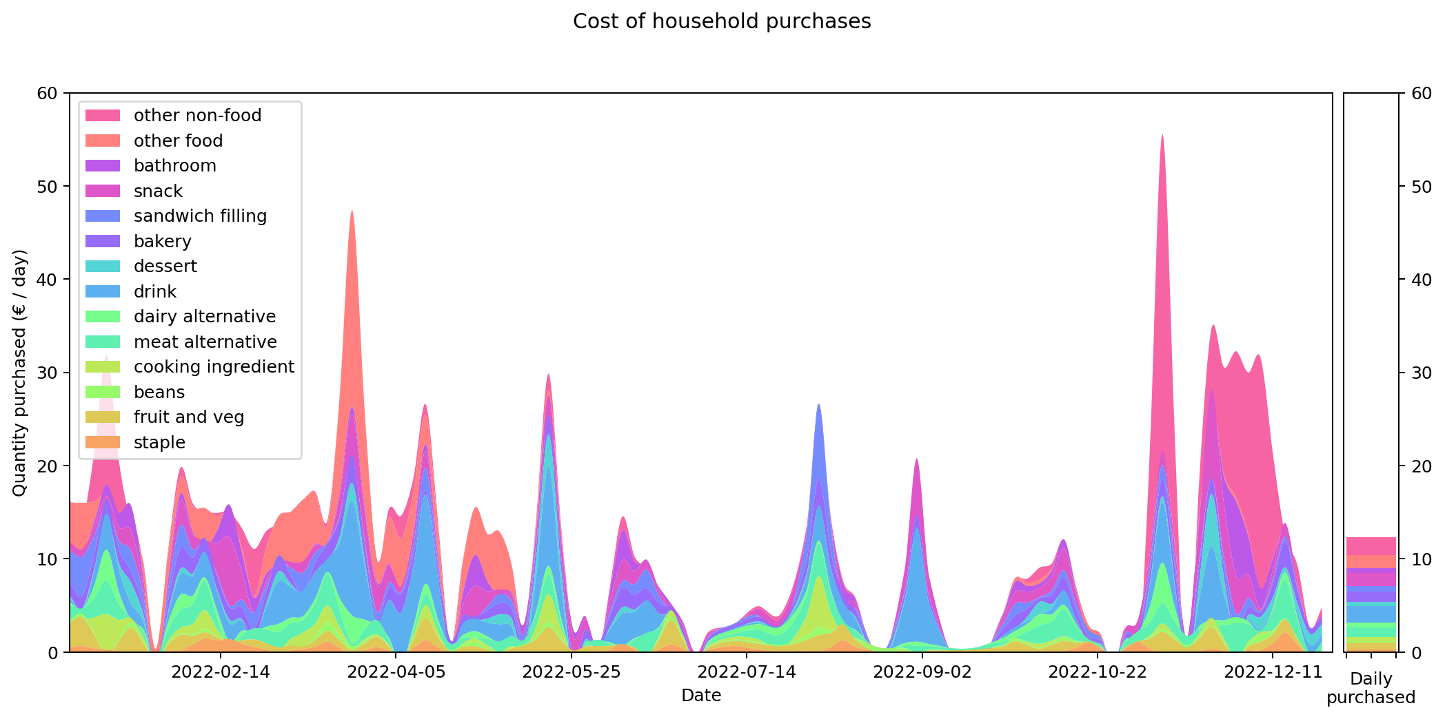
Weight and costs are different things of course. The following graph shows the same purchases in terms of their cost in Euros, rather than their weight in grams. Although you can still see the same three-week shopping cycle, things do shift quite substantially. Drinks and 'other food' are costly (the former is also heavy, but the latter not). During the winter months 'other non-food' becomes a significant cost for me. That's probably Christmas presents.
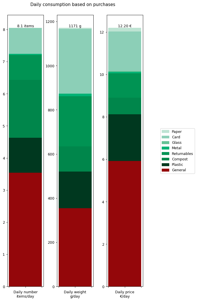
Let's summaries all the results in terms of annual daily averages for the year. The following graph shows the details for all of the data I collected: number of items, weight of items and cost of items.
From this we can see that I'm buying over a kilogram of 'stuff' per day. That's more than I would have expected. The cost of all this stuff is averaging out to €12.20 per day. That's the cost of consumables it takes to run a human. That doesn't include rent, bills, transport, furniture: it's essentially just groceries. Again, that's more than I was expecting.
At this point we're already in a position to compare some of these inputs against outputs. For example, my overall daily input weight of 1171 g per day is getting converted into an output weight of 122.93 g per day. There's a big difference between the two, so where's all that extra weight going? Well, mostly down the toilet and sink I'd imagine.
In the next section we'll break all this down further and do a more careful comparison between inputs and outputs.
Garbage In, Garbage Out
It's interesting to consider how much waste I produce and how much it's all costing me. But by collecting this data, what I really hoped to discover was some connection between the two. The majority of things I throw away are at some time prior to that something I've bought.
In order to understand this relationship better the first step needed is to recategorise my consumption data to match those of my waste data. Given I catalogued exactly what I bought on each occasion, the underlying consumption data I've collected is far more detailed than the waste data I collected, so it makes sense to map the consumption data onto the waste data rather than vice versa.
Here's the graph showing my consumption graphed across the year, measured by weight and split across the eight waste categories. You'll notice that the total weight matches exactly with the graph above showing the data more finely categorised. However the individual strata that make up the total are quite different.
We can also render the cost graph using the same categories. Again, the total cost matches that of our earlier cost graph, but the individual strata that make it up are quite different. This is as we might expect.
Assigning a waste category to each of my purchases turns out to be quite challenging. Consider a box of tea. Should this be categorised as card for the box the tea comes in, or compost for the tea-leaves that are thrown away after brewing? My solution was to give each item only a single category, but to pick the one that disproportionately affects the waste that's thrown away. This involved some judgement calls that weren't always as clear cut as I'd have liked.
The following graph shows the annual summary for the data stratified into waste categories.
Comparing this against the waste summary graphs from earlier, there's obviously a big discrepancy between the weight of inputs and the weight of outputs: there's a roughly ten fold difference. But as we discussed earlier, this isn't unexpected. The proportions don't match up either: general waste makes up a larger proportion of my consumption input than it does my waste output, while the reverse is true for paper.
There are multiple reasons why this might be the case. Miscategorisation is one, but just as likely is that the weight ratios of inputs versus outputs aren't directly comparable. For example, a carton of orange juice is much heavier than a box of doughnuts, but they'll both end up generating a similar mass of cardboard waste. Once again, this highlights how much of an inexact process this all is.
Nevertheless it would be interesting to see if we can track inputs and see how long it takes for them to become outputs. If we can find this, it would provide an idea of how long it takes items within a given category to move from bought to binned. To estimate this we take each of the categories and compare the mean squared error of the consumption and waste data summed over time. We calculate the errors for different offsets between the waste data and the consumption data and compare them. The offset represents how long it takes for something to end up in the bin after purchase.
By minimising the mean square error over the offest we can find the offset that gives the best fit between the two graphs.
Given the ten-fold discrepancy between input weights and output weights, we normalise the data by scaling it so that both inputs and outputs sum to the same value across the year. The following figure shows the errors for each of the categories at different offsets. What we're interested in is the minimum point for each of the lines.
As you can see, in many of the cases the graph drops down to a single local minimum and then goes up again. This is an ideal situation as it gives us a clear candidate for generating the smallest error.
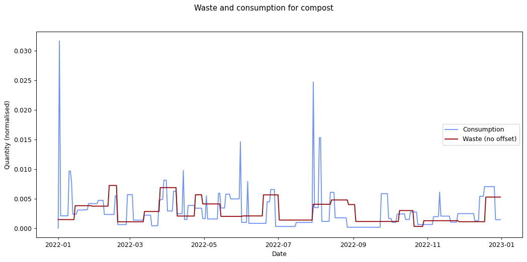
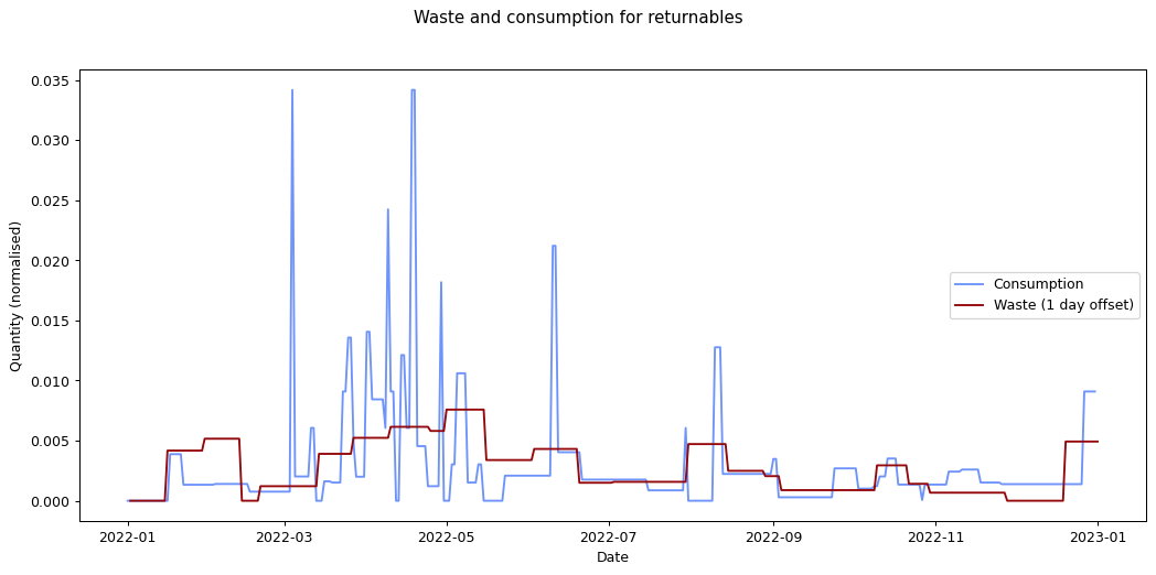
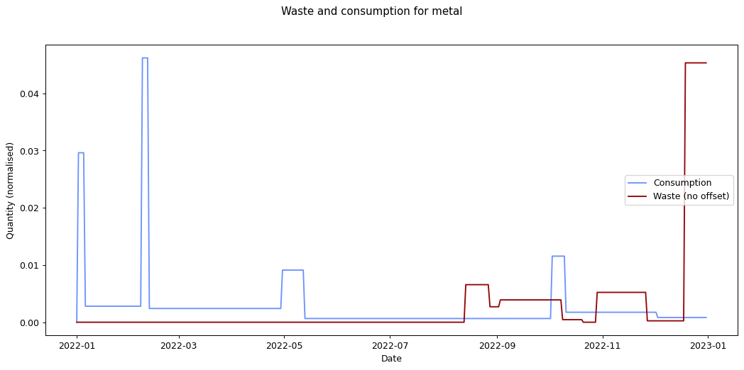
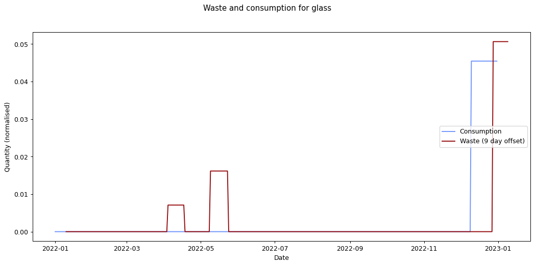
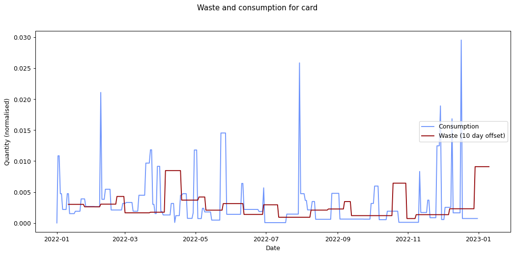
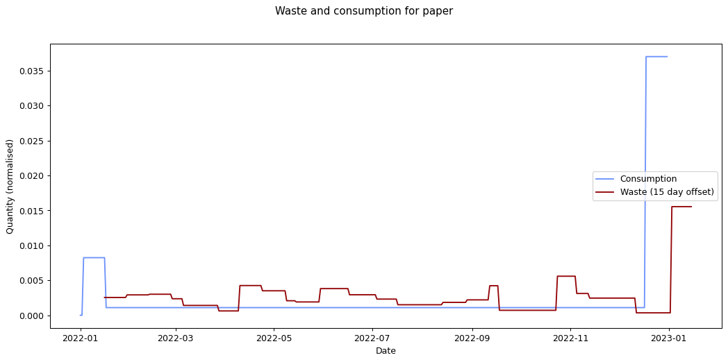
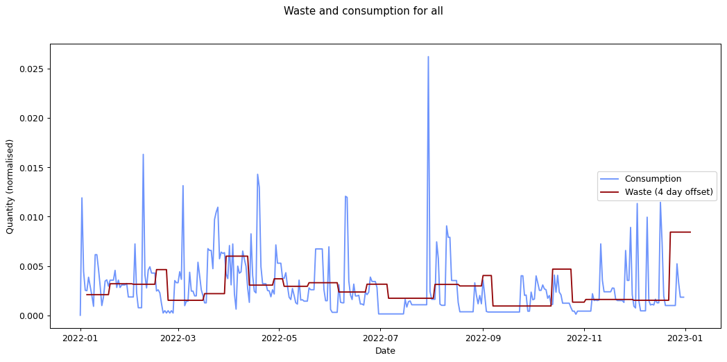
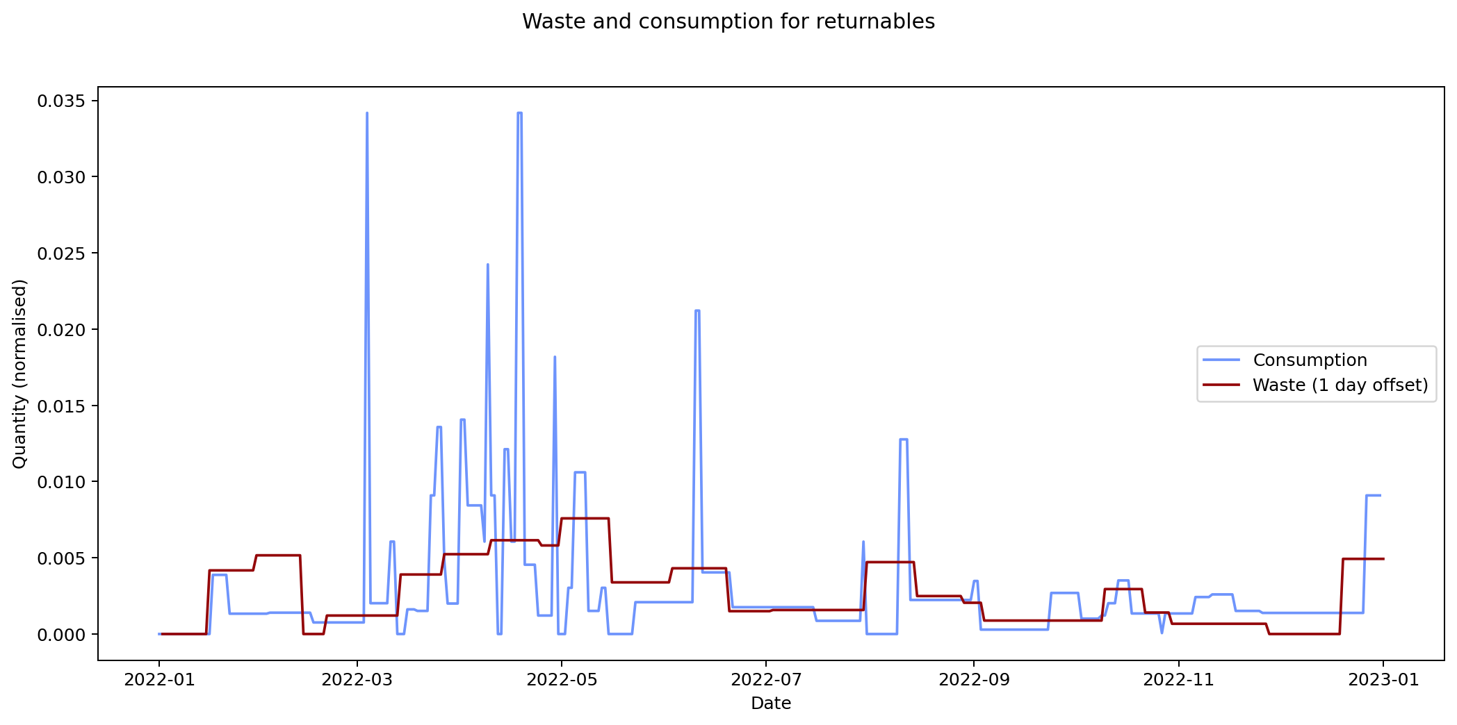
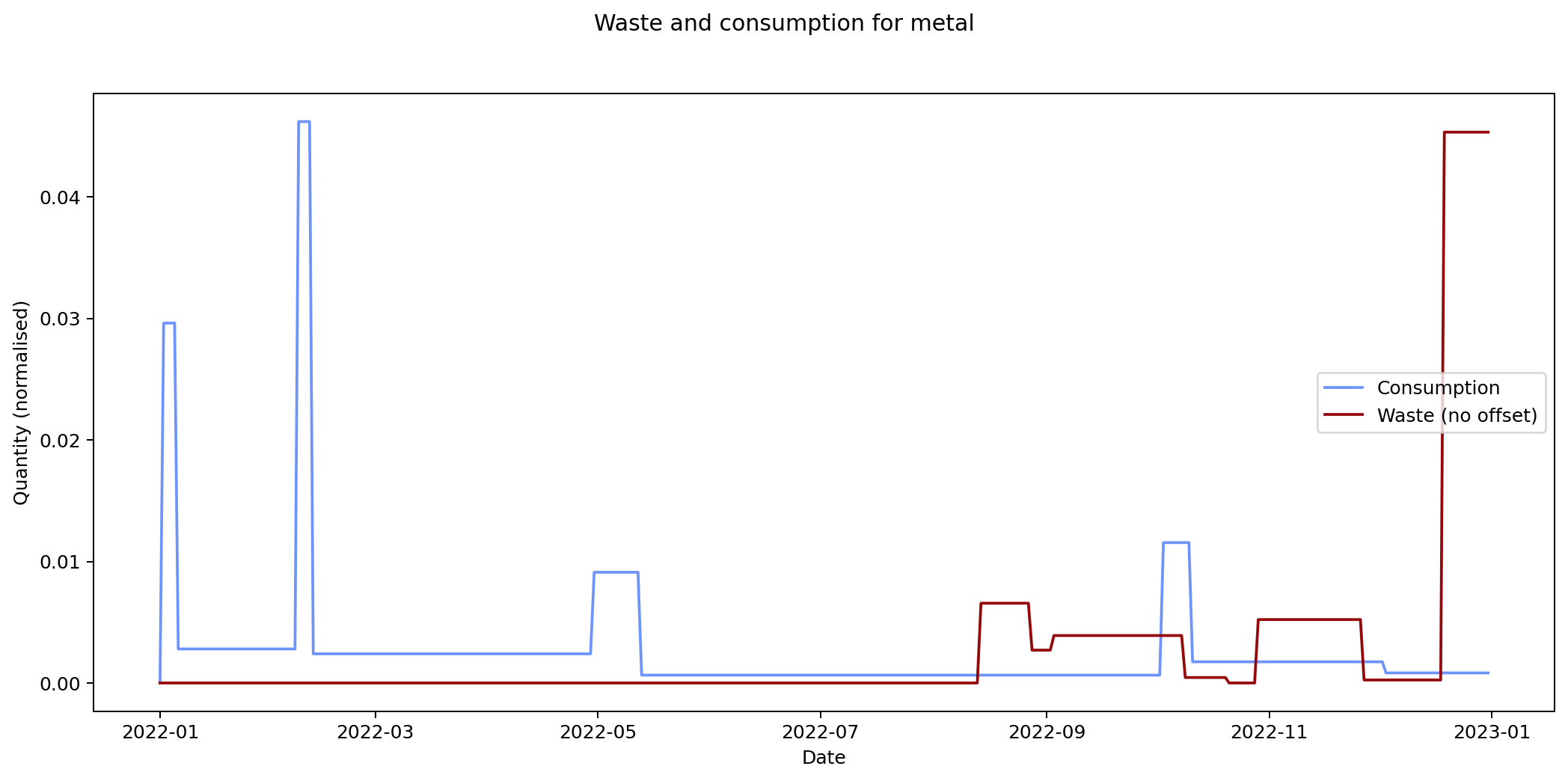
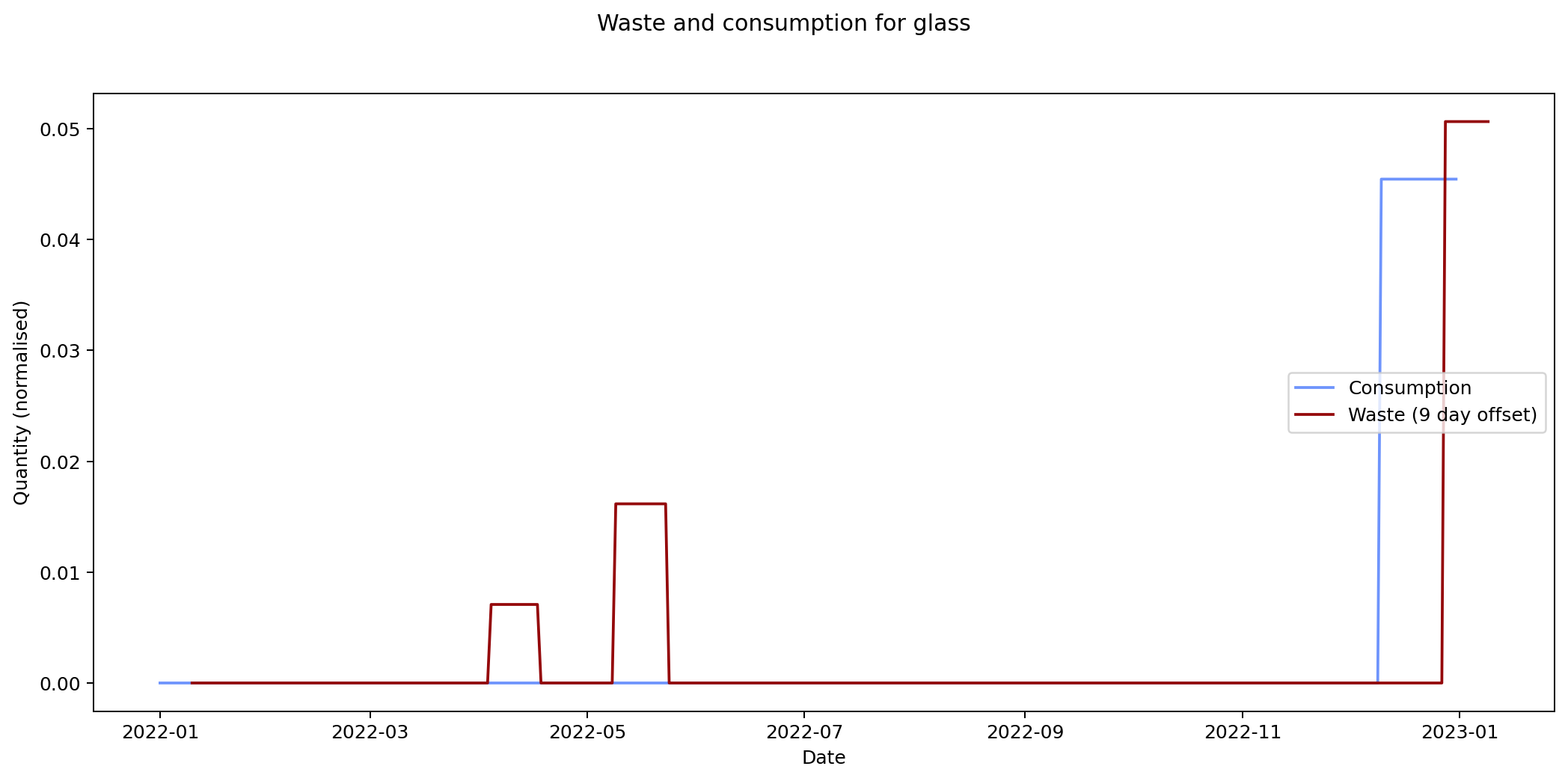
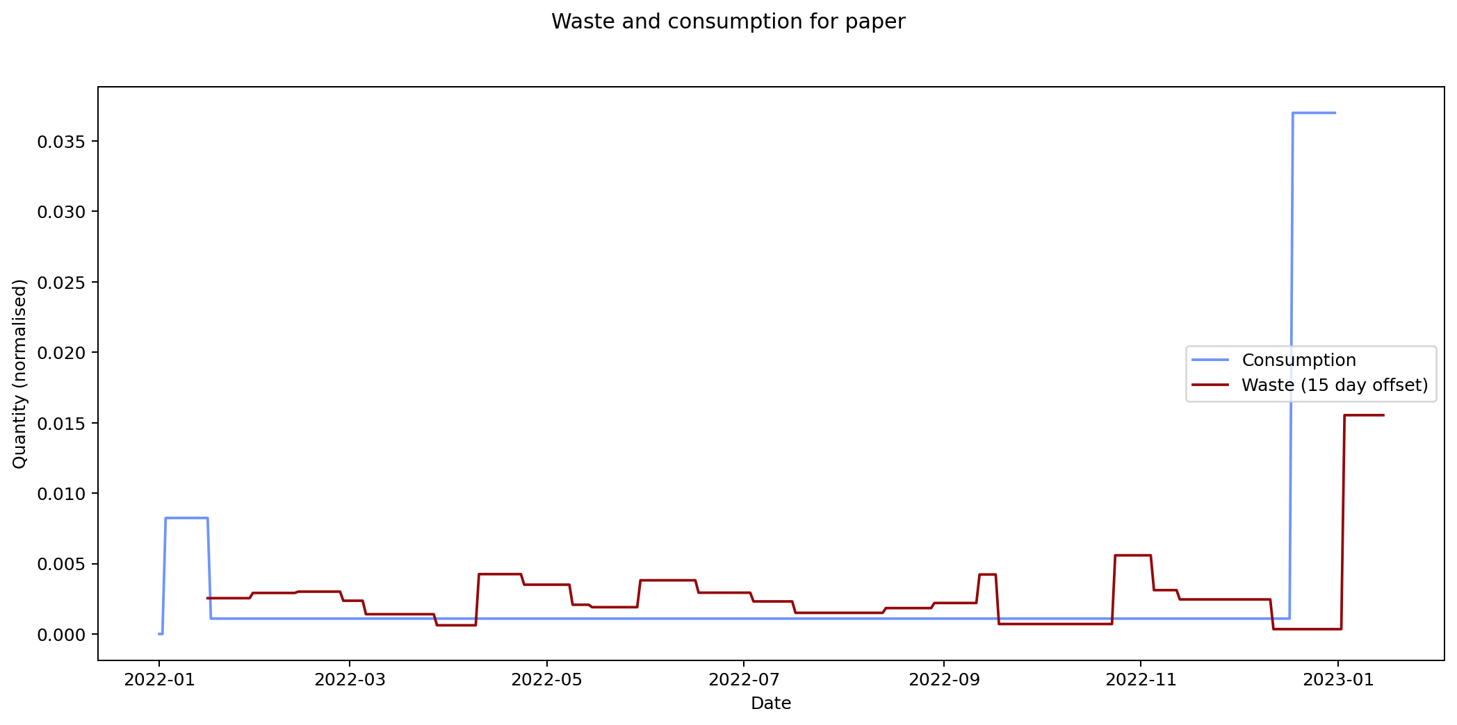
The remaining graphs at the end of this post show the normalised consumption and waste graphs for each of the categories, with the optimal offset applied.
As we can see, there's quite a range, and in some cases (paper, glass) the data is dominated by a few large purchases. In other cases we see a far noisier-looking graph for consumption as compared to waste. This is an artefact of my shopping patterns: while I recorded purchases throughout the week, I tended to only take waste readings fortnightly.
The table below lists the offsets that result in the smallest average mean square error for each of the categories.
The error values don't tell us much since they can't be compared across categories (the values depend on the normalisation scaling which are different for each category). The offsets are the more interesting values. These range between zero days for metal and compost, and fifteen days for paper.
Given the small quantity that went through my household across the year (a total of 180 g), the result for metal isn't so suprising. The result for compost is less clear: there was a relatively consistent flow of compost throughout the year, which could explain the lack of offset. We can see both of these situations in the detailed graphs for metal and compost at the end of this post.
At the other end of the spectrum, paper has a turnaround rate of fourteen days, while glass and card have turnarounds of nine and ten days respectively. The remaining cases are less than a week.
If these are correct, they're interesting results. And they don't seem implausible. However in practice the data is so noisy, and I had to make so many assumptions while processing it, that I wouldn't put much stock in these results.
For all of my inputs and outputs combined the expected turnaround is four days. That's not implausible either, but again, I wouldn't give it much credence. To get a more accurate result, I'd had to have matched inputs with outputs exactly. I collected enough data on my consumption habits for this, but not on my waste-generating habits. I'd have needed to record each of the items in my bins and matched them to the items I bought previously. It's not implausible to imagine I could have done this, but sadly I didn't realise that these were data I'd really need for this analysis.
Summary
What can we conclude from all of this? The most actionable point I get from this is that my efforts to reduce my waste output by cutting out glass and metal, and cutting down on newspapers and magazines, were successful. This is a lesson I take forward.
My three week shopping cycle is also something I could potentially benefit from knowing. I should be planning my menus and performing one main shop every three weeks, with smaller top-ups from the local market in between.
Finally, matching consumed inputs with waste outputs turned out to be more challenging than I was expecting, to the extent that it's not clear how much I really achieved from recording everything I purchased in quite such detail.
Nevertheless I feel it was a worthwhile experience: I definitely gained something intangible from the process that isn't reflected in the analysis of the data. I'll continue to estimate my CO2 output and try to reduce the amount of waste I generate on a daily basis. This is the real win: I'm much more aware of what I buy and throw away, and for me, reducing this waste is a crucial aspect of limiting my negative impact on the wider environment.
General
Plastic
Compost
Returnables
Metal
Glass
Card
Paper
All
It's now Sunday 4th June, nearly six months after I moved from Finland to the UK and finished collecting data, and high time I put pen to paper... fingers to keyboard... to write up the results. There's going to be quite a lot to look at here, so I've split it into three sections: my waste data output; my consumption data input; and how they relate to one another.
Waste Data Output
Let's start with my outputs. I collected data about my rubbish from 18th August 2019 through to 1st January 2023, nearly three and a half years. You can read all about the results from earlier years on my waste pages.
What of 2022? As with previous years there are peaks and troughs that go alongside my activities. There's a big spike around Christmas when Joanna visited and we had two whole people living in my flat (we don't see the same spike in 2021 because that year I spent Christmas with Joanna in the UK). There's a trough around August when Joanna and I went on holiday. Similar holiday troughs — at slightly different times of year — can be seen in 2020 and 2021.
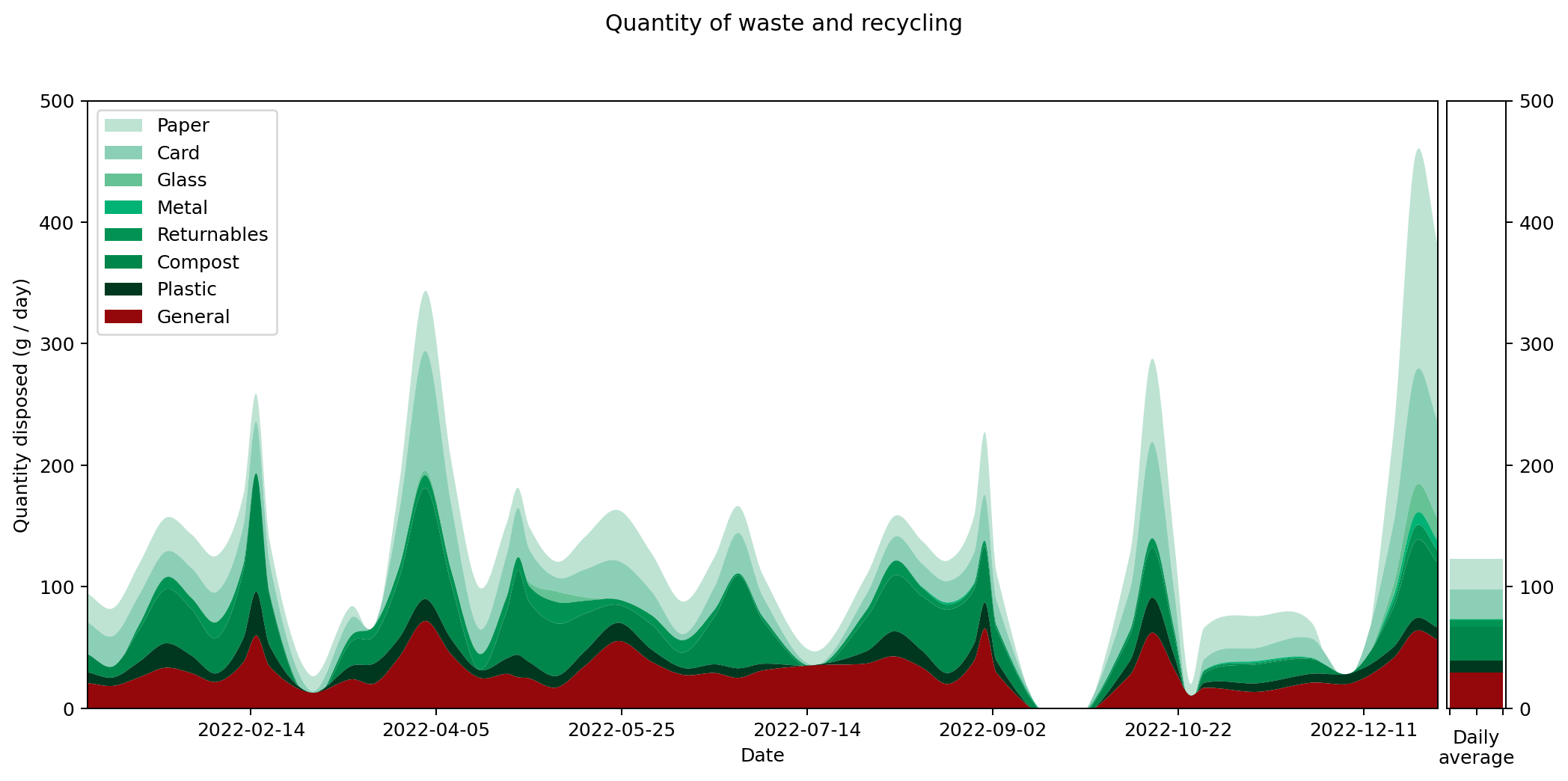
It's hard to get an overall picture from this temporal view, so perhaps the overall averages for the different categories are more insightful. These are shown on the right hand side of the graph. It's also interesting to compare them against previous years. Here's the same information collated into a couple of graphs.
On the left hand side we can see the weight of waste output for each category. This is the average daily output for the stated year. As you can see, I worked quite hard to reduce my waste output year-on-year, cutting it by around half in 2020 and then by nearly a quarter again in 2021. That seems to have been my limit though: my 2022 level is just marginally higher than in 2021.
To understand what changed, it's helpful to look at the graphs in terms of proportions rather than absolute values. The right hand graph shows each of the outputs as a proportion of the total year's output. What we can see is that from 2019 to 2021 I greatly reduced my glass and metal output. Looking at both graphs, we can see that I also reduced my paper and compost output quite considerably, but not as an overall proportion.
In contrast, both the proportions and absolute values for 2021 and 2022 are very similar.
None of this is a huge surprise to me: I worked really hard to reduce my glass, metal and paper waste. I cut glass bottles and metal cans out of my shop almost entirely, switching them to plastic bottles, cardboard cartons and cardboard containers instead. You can read more about my reasoning for doing this in an earlier post. I cut down my paper waste output by putting a sing reading 'Ei mainoksia kiitos!' on my door (simple things) and by restructuring my magazine and postal subscriptions.
The following table gives the values for each of the categories in full. This is my average daily waste output measured in grammes.
| Year | 2019 | 2020 | 2021 | 2022 |
|---|---|---|---|---|
| General | 45.16 | 28.33 | 28.26 | 29.28 |
| Plastic | 6.65 | 11.27 | 9.52 | 9.97 |
| Compost | 94.84 | 43.51 | 31.11 | 27.85 |
| Returnables | 8.70 | 5.99 | 6.36 | 5.33 |
| Metal | 6.86 | 0.32 | 0.16 | 0.49 |
| Glass | 77.24 | 13.29 | 1.81 | 0.95 |
| Card | 35.27 | 27.44 | 20.93 | 23.89 |
| Paper | 64.82 | 24.83 | 21.73 | 25.18 |
| Total | 339.53 | 154.98 | 119.88 | 122.93 |
These values are rather small and hard to handle, so it can help to understand what these numbers mean on an annual basis. The following table shows the same values given in kilograms and multiplied up by a factor of 365.25. These represent the amount of waste for each category that I generated over the period of a year measured in kilogrammes.
| Year | 2019 | 2020 | 2021 | 2022 |
|---|---|---|---|---|
| General | 16.50 | 10.35 | 10.32 | 10.70 |
| Plastic | 2.43 | 4.12 | 3.48 | 3.64 |
| Compost | 34.64 | 15.89 | 11.36 | 10.17 |
| Returnables | 3.18 | 2.19 | 2.32 | 1.95 |
| Metal | 2.50 | 0.12 | 0.06 | 0.18 |
| Glass | 28.21 | 4.85 | 0.66 | 0.35 |
| Card | 12.88 | 10.02 | 7.64 | 8.73 |
| Paper | 23.67 | 9.07 | 7.94 | 9.20 |
| Total | 124.01 | 56.61 | 43.78 | 44.90 |
Consumption Data Input
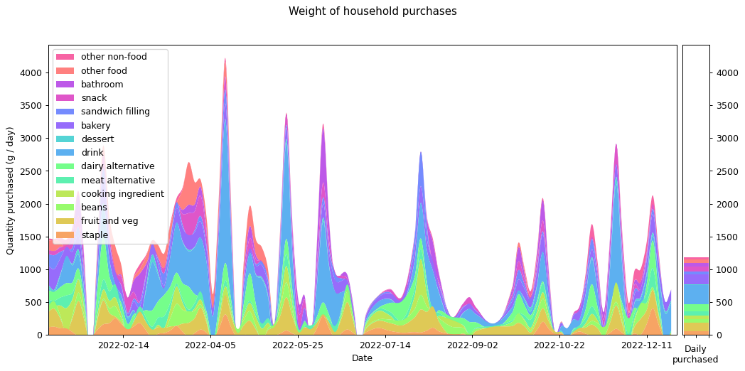
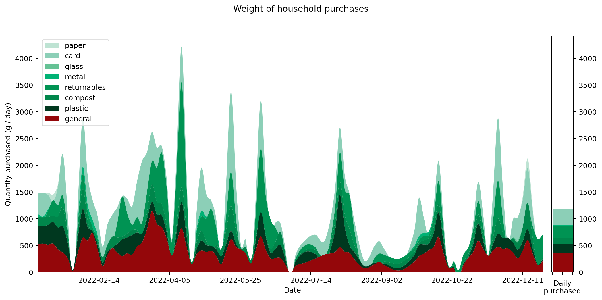
Now let's look at my 2022 consumption data. The following graph shows what I bought in terms of weight. The categories were chosen by going through each item and selecting one of the existing categories if it fit, or creating a new one otherwise. The software I used for doing this is in the repository on GitHub.
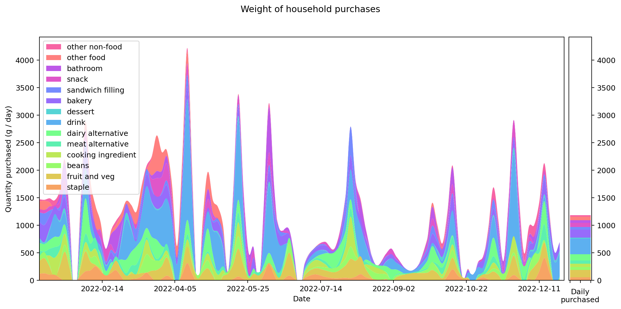
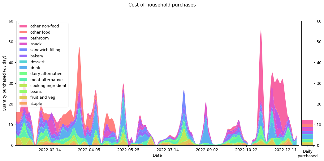
It's interesting that there's so much variation through the year. Often this is driven by specific categories. I bought especially large quantities of soft drink in March, April and November, probably because of the weather. There are a few periods where my purchasing dropped to zero, because I was travelling away from home. Otherwise the cycle seems to be largely based on a three-week shopping period.
This is actually contrary to what I would have expected. I had thought my shopping cycle was roughly weekly, with smaller more frequent shopping trips for essentials (such as bread). But the graph tells me that in practice my shopping increased every third week or so. If I'd known this I might have organised things more intentionally.
Weight and costs are different things of course. The following graph shows the same purchases in terms of their cost in Euros, rather than their weight in grams. Although you can still see the same three-week shopping cycle, things do shift quite substantially. Drinks and 'other food' are costly (the former is also heavy, but the latter not). During the winter months 'other non-food' becomes a significant cost for me. That's probably Christmas presents.
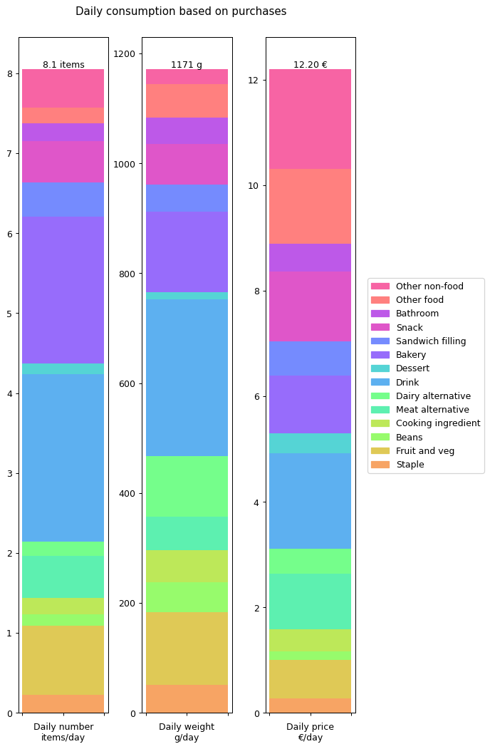
Let's summaries all the results in terms of annual daily averages for the year. The following graph shows the details for all of the data I collected: number of items, weight of items and cost of items.

From this we can see that I'm buying over a kilogram of 'stuff' per day. That's more than I would have expected. The cost of all this stuff is averaging out to €12.20 per day. That's the cost of consumables it takes to run a human. That doesn't include rent, bills, transport, furniture: it's essentially just groceries. Again, that's more than I was expecting.
At this point we're already in a position to compare some of these inputs against outputs. For example, my overall daily input weight of 1171 g per day is getting converted into an output weight of 122.93 g per day. There's a big difference between the two, so where's all that extra weight going? Well, mostly down the toilet and sink I'd imagine.
In the next section we'll break all this down further and do a more careful comparison between inputs and outputs.
Garbage In, Garbage Out
It's interesting to consider how much waste I produce and how much it's all costing me. But by collecting this data, what I really hoped to discover was some connection between the two. The majority of things I throw away are at some time prior to that something I've bought.
In order to understand this relationship better the first step needed is to recategorise my consumption data to match those of my waste data. Given I catalogued exactly what I bought on each occasion, the underlying consumption data I've collected is far more detailed than the waste data I collected, so it makes sense to map the consumption data onto the waste data rather than vice versa.
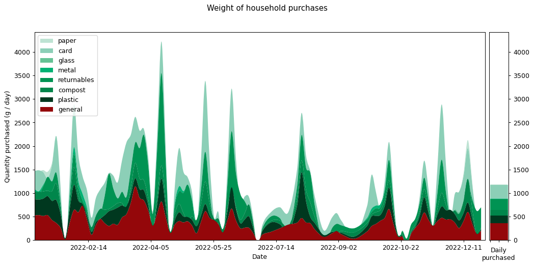
Here's the graph showing my consumption graphed across the year, measured by weight and split across the eight waste categories. You'll notice that the total weight matches exactly with the graph above showing the data more finely categorised. However the individual strata that make up the total are quite different.
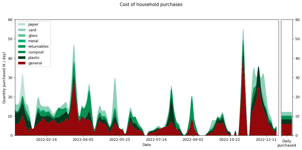
We can also render the cost graph using the same categories. Again, the total cost matches that of our earlier cost graph, but the individual strata that make it up are quite different. This is as we might expect.

Assigning a waste category to each of my purchases turns out to be quite challenging. Consider a box of tea. Should this be categorised as card for the box the tea comes in, or compost for the tea-leaves that are thrown away after brewing? My solution was to give each item only a single category, but to pick the one that disproportionately affects the waste that's thrown away. This involved some judgement calls that weren't always as clear cut as I'd have liked.
The following graph shows the annual summary for the data stratified into waste categories.

Comparing this against the waste summary graphs from earlier, there's obviously a big discrepancy between the weight of inputs and the weight of outputs: there's a roughly ten fold difference. But as we discussed earlier, this isn't unexpected. The proportions don't match up either: general waste makes up a larger proportion of my consumption input than it does my waste output, while the reverse is true for paper.
There are multiple reasons why this might be the case. Miscategorisation is one, but just as likely is that the weight ratios of inputs versus outputs aren't directly comparable. For example, a carton of orange juice is much heavier than a box of doughnuts, but they'll both end up generating a similar mass of cardboard waste. Once again, this highlights how much of an inexact process this all is.
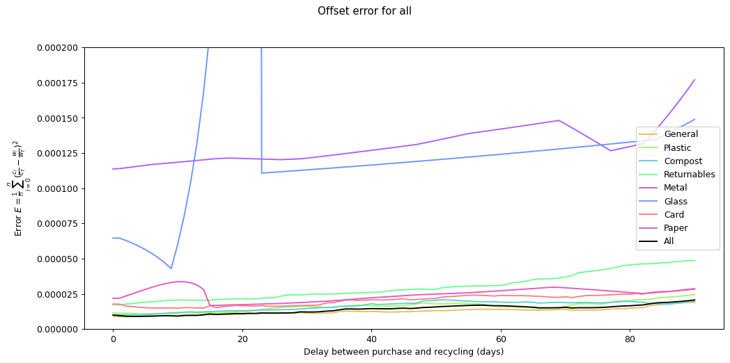
Nevertheless it would be interesting to see if we can track inputs and see how long it takes for them to become outputs. If we can find this, it would provide an idea of how long it takes items within a given category to move from bought to binned. To estimate this we take each of the categories and compare the mean squared error of the consumption and waste data summed over time. We calculate the errors for different offsets between the waste data and the consumption data and compare them. The offset represents how long it takes for something to end up in the bin after purchase.
By minimising the mean square error over the offest we can find the offset that gives the best fit between the two graphs.
Given the ten-fold discrepancy between input weights and output weights, we normalise the data by scaling it so that both inputs and outputs sum to the same value across the year. The following figure shows the errors for each of the categories at different offsets. What we're interested in is the minimum point for each of the lines.
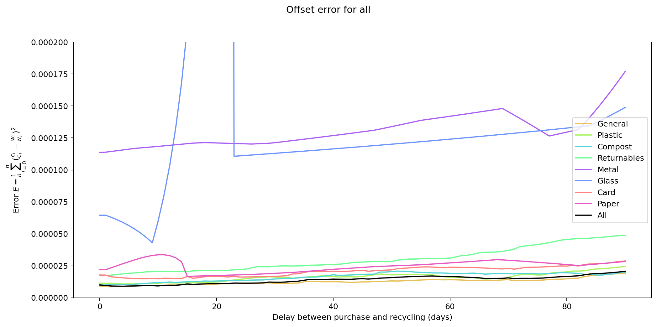
As you can see, in many of the cases the graph drops down to a single local minimum and then goes up again. This is an ideal situation as it gives us a clear candidate for generating the smallest error.
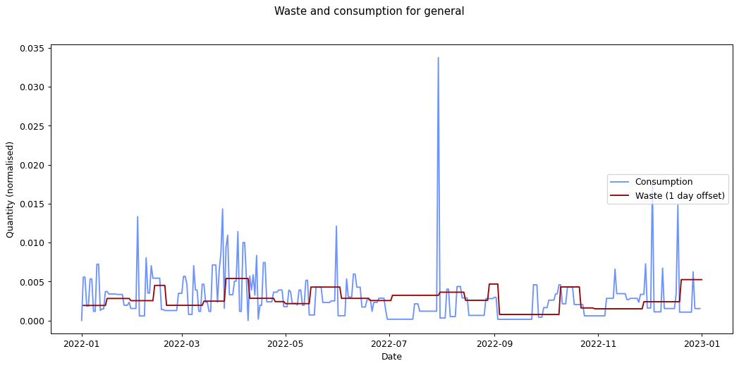
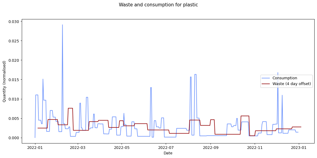
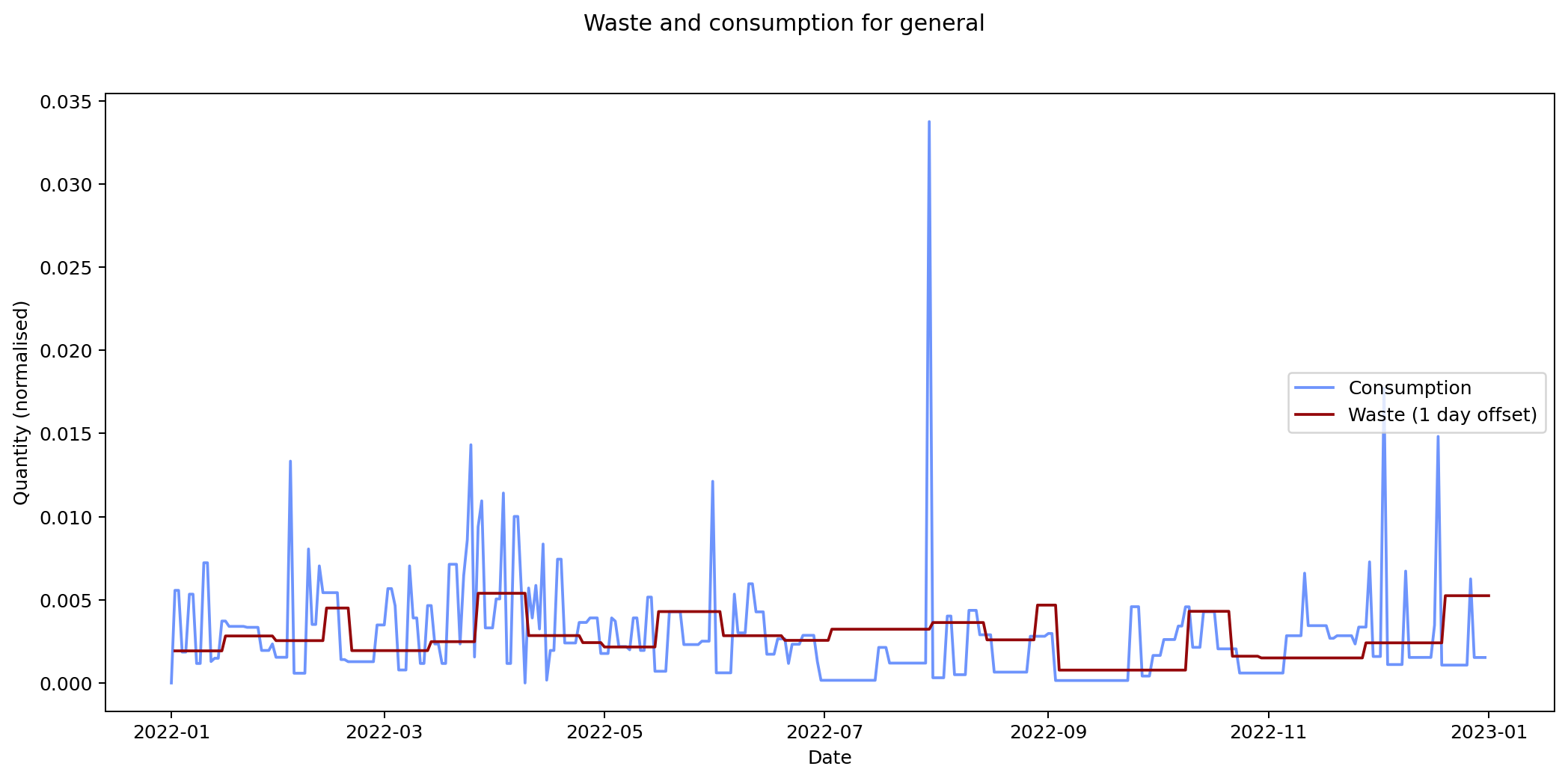
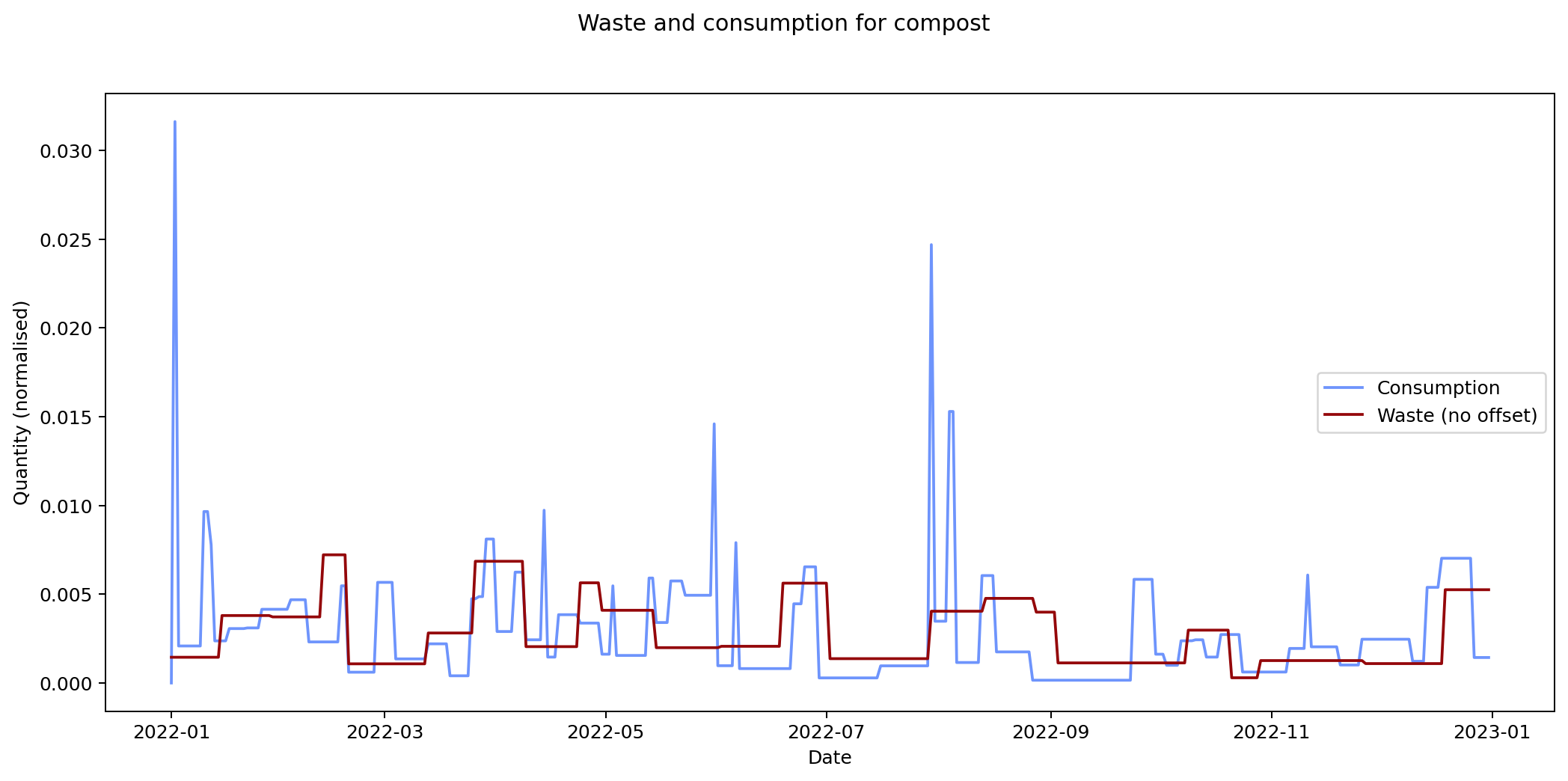
The remaining graphs at the end of this post show the normalised consumption and waste graphs for each of the categories, with the optimal offset applied.
As we can see, there's quite a range, and in some cases (paper, glass) the data is dominated by a few large purchases. In other cases we see a far noisier-looking graph for consumption as compared to waste. This is an artefact of my shopping patterns: while I recorded purchases throughout the week, I tended to only take waste readings fortnightly.
The table below lists the offsets that result in the smallest average mean square error for each of the categories.
| Category | Min mean square error | Offset (days) |
| general | 8.700 × 10⁻⁶ | 1 |
| plastic | 1.075 × 10⁻⁵ | 4 |
| compost | 9.964 × 10⁻⁶ | 0 |
| returnables | 1.729 × 10⁻⁵ | 1 |
| metal | 1.137 × 10⁻⁴ | 0 |
| glass | 4.296 × 10⁻⁵ | 9 |
| card | 1.483 × 10⁻⁵ | 10 |
| paper | 1.672 × 10⁻⁵ | 15 |
| all | 9.008 × 10⁻⁶ | 4 |
The error values don't tell us much since they can't be compared across categories (the values depend on the normalisation scaling which are different for each category). The offsets are the more interesting values. These range between zero days for metal and compost, and fifteen days for paper.
Given the small quantity that went through my household across the year (a total of 180 g), the result for metal isn't so suprising. The result for compost is less clear: there was a relatively consistent flow of compost throughout the year, which could explain the lack of offset. We can see both of these situations in the detailed graphs for metal and compost at the end of this post.
At the other end of the spectrum, paper has a turnaround rate of fourteen days, while glass and card have turnarounds of nine and ten days respectively. The remaining cases are less than a week.
If these are correct, they're interesting results. And they don't seem implausible. However in practice the data is so noisy, and I had to make so many assumptions while processing it, that I wouldn't put much stock in these results.
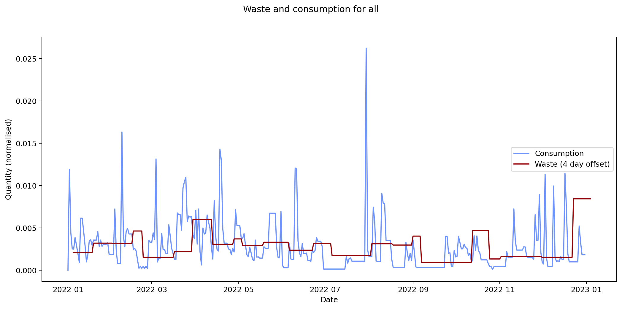
For all of my inputs and outputs combined the expected turnaround is four days. That's not implausible either, but again, I wouldn't give it much credence. To get a more accurate result, I'd had to have matched inputs with outputs exactly. I collected enough data on my consumption habits for this, but not on my waste-generating habits. I'd have needed to record each of the items in my bins and matched them to the items I bought previously. It's not implausible to imagine I could have done this, but sadly I didn't realise that these were data I'd really need for this analysis.
Summary
What can we conclude from all of this? The most actionable point I get from this is that my efforts to reduce my waste output by cutting out glass and metal, and cutting down on newspapers and magazines, were successful. This is a lesson I take forward.
My three week shopping cycle is also something I could potentially benefit from knowing. I should be planning my menus and performing one main shop every three weeks, with smaller top-ups from the local market in between.
Finally, matching consumed inputs with waste outputs turned out to be more challenging than I was expecting, to the extent that it's not clear how much I really achieved from recording everything I purchased in quite such detail.
Nevertheless I feel it was a worthwhile experience: I definitely gained something intangible from the process that isn't reflected in the analysis of the data. I'll continue to estimate my CO2 output and try to reduce the amount of waste I generate on a daily basis. This is the real win: I'm much more aware of what I buy and throw away, and for me, reducing this waste is a crucial aspect of limiting my negative impact on the wider environment.
General

Plastic
Compost
Returnables
Metal
Glass
Card
Paper
All
Comments
Uncover Disqus comments